You want people to click on the website link in your email signature, right? Have you ever thought about what happens when they do? Have you looked at your website on a mobile device?
Here are some questions I have been asked recently about Responsive Web Design…
- “Is that a mobile site?”
- “Is it like an app?”
- “I bet that is expensive, isn’t it?”
Answers – No, no, and NO.
First, let’s get into the reasons why your website should have Responsive Web Design…
Responsive Web Design will make the website display well, whatever device it is being viewed on. Most websites these days don't use Flash imagery, so on a phone they look similar, but usually small versions of the website, which can't be viewed properly.
The facts
- 90% of smartphone owners access the same email account on mobile and desktop.
- More email is read Mobile than on a desktop email client or via webmail.
- 68% of UK smartphone owners used their device to check email in the past 30 days.
The problem
You want people to click on the website link in your email signature, right? Have you ever thought about what happens when they do? Have you looked at your website on a mobile device?
See for yourself
Look closely at your Google Analytics and you will see that your bounce rate is higher for mobile devices. This is usually because your website is too hard to use on a small device.
Mobile Website or Responsive Design?
Many people think that to get a website to look good on a smartphone they have to spend thousands on a mobile site or an app. This is a common misunderstanding. Mobile websites have their place, but most companies don't want this at all.
Mobile Websites
Mobile sites are useful if that is specifically what your business demands, but they are not essential for a good browser experience. All of our websites function well on touch devices as they are, like these – CountryShires, KCM, c3imaging; however there are ways to display them differently on every device with Responsive Web Design.
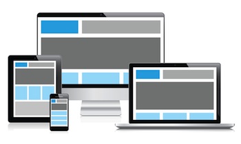
Responsive Web Design
Rather than just being smaller, your content will be displayed in a way that works best on the device used. Whether it is android, iPhone, iPad, small screen, or a large wide screen, your website will display content in the most visually optimised way.
Examples
Go on, try looking at these websites on a normal screen, and then on a smaller device. If you don't have a smaller device now, just make your current screen smaller to see the effect.
Elite West Holidays, Star Legal, Sun Valley, Peter Evans, Peak Performance, AGS Windows, AgileKRC, Pink Evolutions, Rose Green Reclamation.
Software like WordPress have plug-ins that work to some extent, but they will never work as well as a specifically developed website, and it is well documented how plug-ins slow down these template websites.
We build websites using clean, responsive code throughout, so that it will recognise the resolution of the browser’s device and display the website accordingly. Soon all websites will have this facility, if your website is not responsive, you should seriously consider this now.
What does your website look like on mobile devices, and how does it perform on touch screens? Let me know…